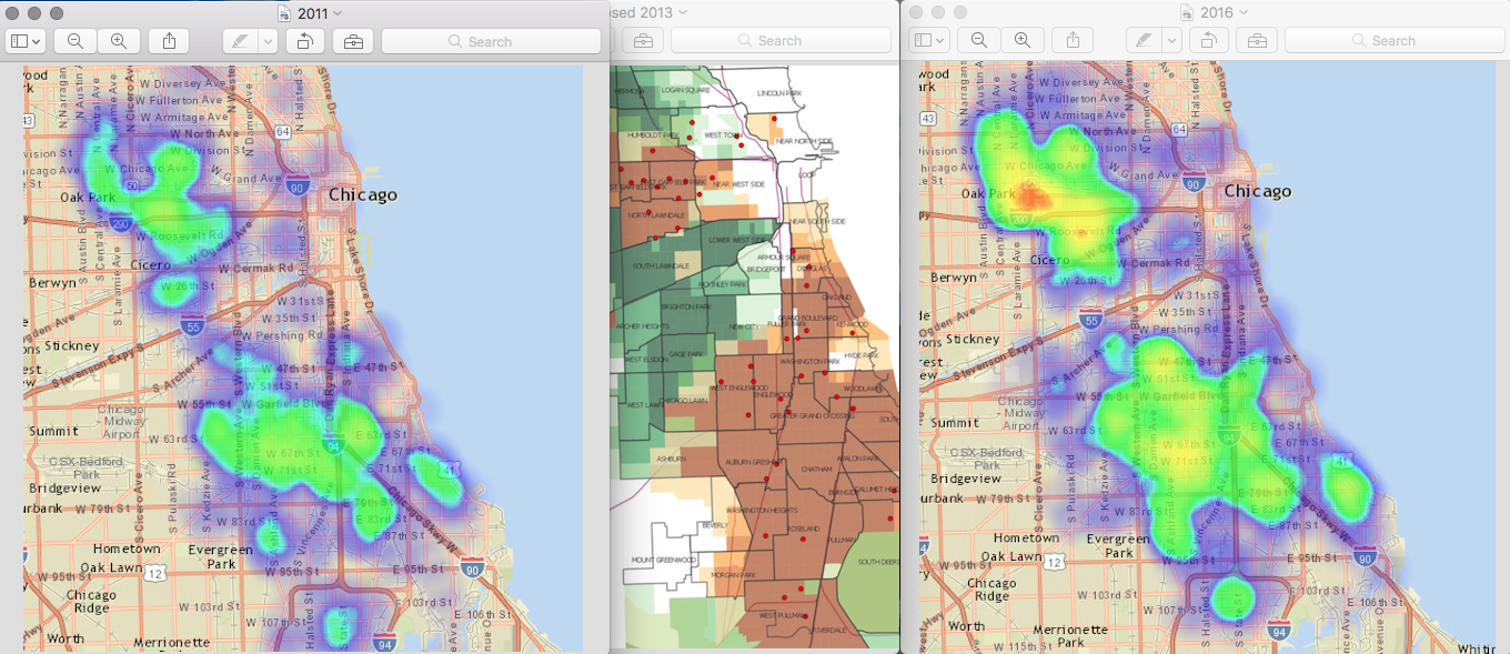
In the debate over budgets, spending, cuts, services, fairness, government and personal responsibilities, I do my best to listen to people’s stories. However, some pictures speak just as loudly, and sometimes those pictures are of cartographic data. Here’s some maps I made this morning, compared to a map made several years ago.
In short, represented here is a heat map of homicides 2 years before Chicago closed 50 schools “due to budget shortfalls and population shifts,” as compared to a plot map of where those school closings occurred “due to budget short falls and population shifts,” next to a second heat map of homicides 2 years after Chicago closed those 50 schools.
